Lectura
Project: Lectura - UX Writing for an Online Learning Platform
Role: UX Writer
Overview:
Lectura aims to provide an online platform for students to learn various subjects. The platform's goal is to simplify the learning experience and make it more accessible and engaging for students, especially those who may find traditional classroom settings or textbook-based learning challenging.
Challenge:
The primary challenge for this project was to create a user experience that was intuitive, hassle-free, and minimized cognitive burdens for students. Many students often find the process of selecting and learning new subjects to be daunting or overwhelming, especially when it comes to school-related subjects. Lectura needed to address this challenge by providing a seamless and straightforward experience that would remove any unnecessary barriers or complications in the subject selection and learning process.
Solution:
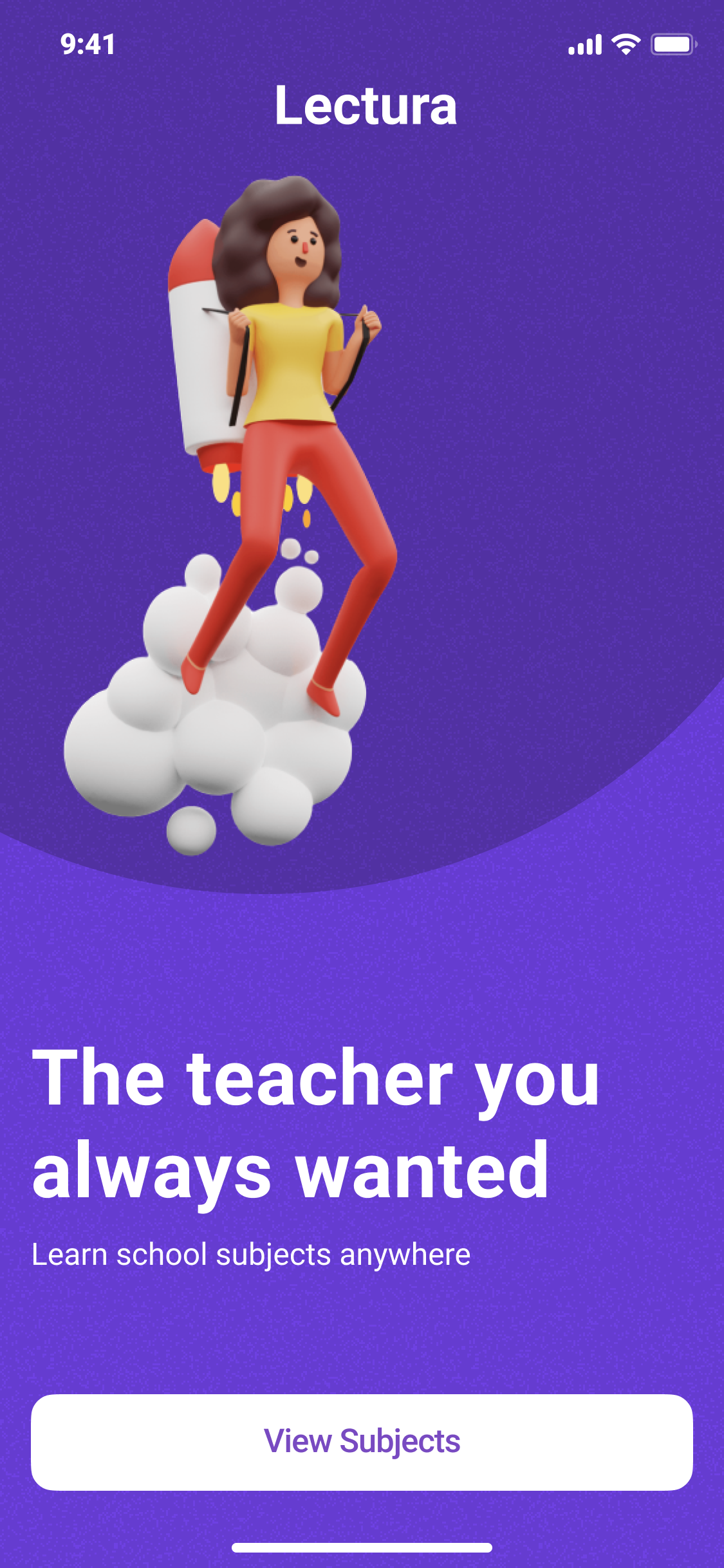
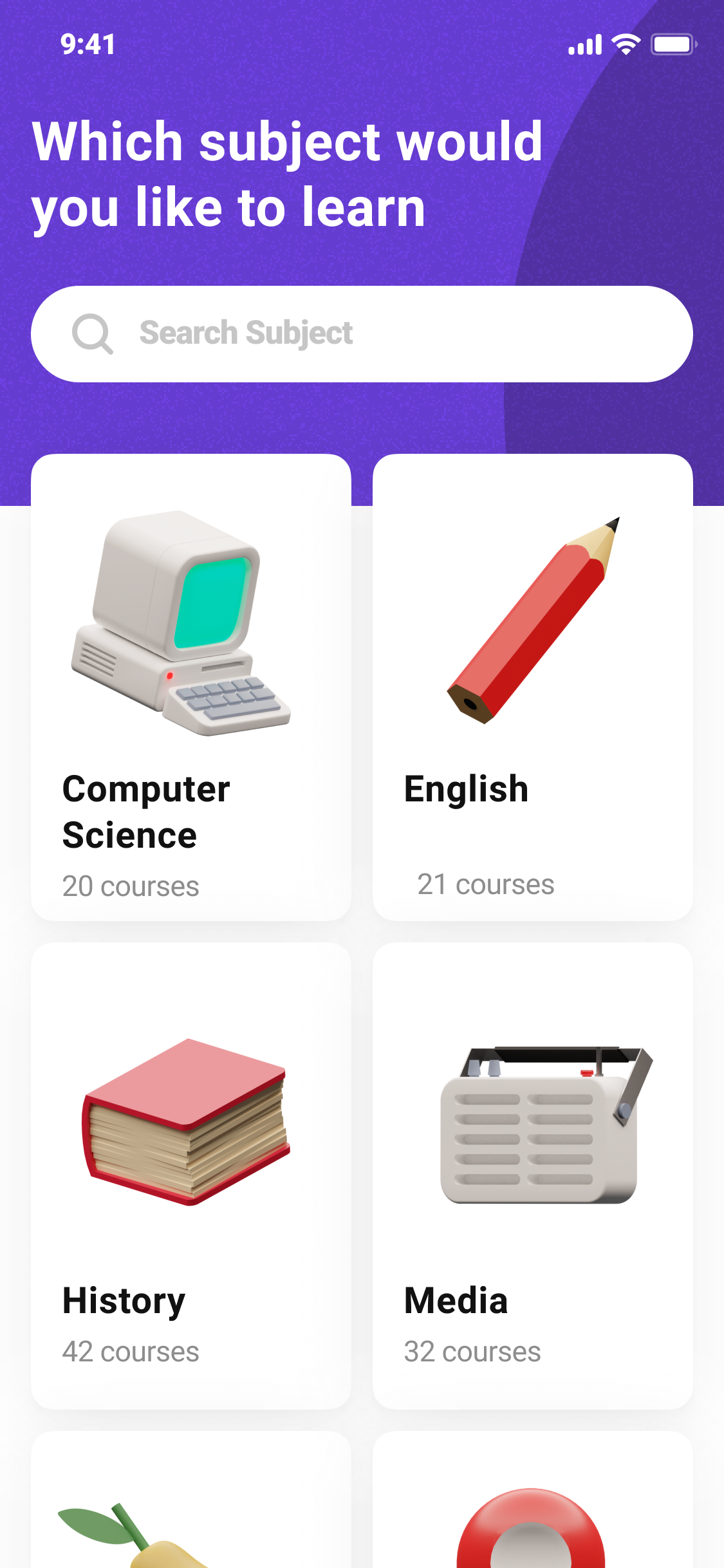
To address this challenge, I developed a content strategy that focused on minimalism, clarity, and user guidance. The solution involved crafting concise yet informative copy that complemented the platform's visual elements, such as bright colors and bold images, while providing just enough context and direction to help students navigate the platform effortlessly.
Approach:
1. Minimal and Straightforward Copy: I wrote copy that was intentionally brief and to-the-point, acknowledging that students often prefer not to read lengthy texts, especially when it comes to educational platforms. The copy aimed to provide essential information without overwhelming the user with excessive content.
2. User Guidance: Recognizing that students may need some guidance in the subject selection and learning process, I incorporated short but helpful explanations throughout the platform. These explanations aimed to clarify what students were seeing and what actions they needed to take, ensuring a smooth and intuitive user experience.
3. Brand Voice and Tone: I developed a brand voice and tone for Lectura that struck a balance between professionalism and friendliness. The content aimed to establish Lectura as a trustworthy and knowledgeable platform while maintaining an approachable and engaging tone that would resonate with the student demographic.
4. Visual Harmony: The copy was designed to complement and enhance the platform's visual elements, such as bright colors and bold images. The minimal text allowed these visual elements to take center stage while providing just enough context and guidance for users to understand and engage with the platform effectively.
By following this approach, I created a user-centered content strategy that prioritized simplicity, clarity, and user guidance. The resulting experience aimed to remove cognitive burdens for students, making the process of selecting and learning subjects on the Lectura platform as seamless and enjoyable as possible.

